5 Reasons Why Website Navigation Is Important

Table of Contents:
- Website Navigation Definition
- Importance of Website Navigation
- Achieve Effective Navigation with Ready Artwork
What is a Website Navigaton?
Navigation on a website is achieved by a collection of links that form the Website Navigation Menu or the Website Navigation Bar. This navigation menu or bar is usually the collection of links you see placed vertically on the left or horizontally near the top of the web page and sometimes on the footer of the web page.
Although it may seem negligible, having organized and easy-to-follow navigation for a website is very beneficial and important for the overall user experience. Visiting a website with disorganized navigation is like driving somewhere with hazy directions: you might get lost along the way because the route is hard to follow.
Luckily, Ready Artwork is here to provide you with 5 reasons why navigation is important and how to achieve effective navigation!

1. Increased Visit Duration & Decreased Bounce Rate
An easily navigable website increases the time a visitor or customer remains on your website. This allows visitors more time to explore your website and discover information about your company. If visitors/customers visit your website and find that it is difficult to navigate, they may not want to take the time to dig through your website and may “bounce.” A bounce occurs when a web site visitor only views a single page on a website rather than continues viewing other pages within the same site
2. Product Purchases
Easy to follow directions that are established through strategic website navigation allow customers to effortlessly go through the process of viewing and purchasing products.
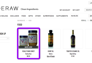
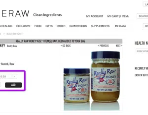
Maderaw’s website has a clear route for customers to purchase products. The following images highlight the “road” to purchasing a product on their website.
First, we can select “Food” in the navigation bar. Then, at the product page for food, we select “Really Raw Honey.” This brings us to the product’s page, where we can select our quantity and add the item to our cart.
3. Short & to-the-Point
Because of the high-speed technology that exists today, people like everything fast. Navigation bars with concise and clear categories allow people to rapidly and easily access information about your company.
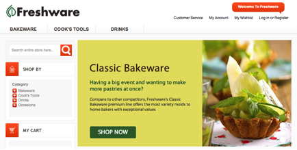
For example, the Freshware website’s navigation bar shows exactly what the company does. From the get-go, a visitor can tell by looking at the categories listed that Freshware specializes in baking and cooking tools.
4. Serial Position Effect
There is a psychological concept called the Serial Position Effect, which describes how a person tends to pay more attention to and retain information to things that appear at the beginning and end (Psychology Dictionary). This means that people pay less attention to the body portion of a web page. Since navigation information is usually at the top and sometimes the bottom of a web page, it is very important to insert important links and information in these sections for a higher engagement rate.
5. Overall Design
Since navigation bars are most often placed horizontally at the top of a website or vertically on the left, it is important to be consistent with these placements. Navigation bars placed in the middle of a webpage are non-standard and difficult for visitors to locate. Standardized, organized and uncluttered navigation design increases the overall aesthetic appeal of a website’s design. Navigation links that are short and to the point (see tip #3) also create a very clean and uncluttered appearance.
Good navigation is a useful strategy to boost website design and page visits. Keep these guidelines in mind when planning your next business website!
Achieve Effective Navigation with Ready Artwork
If you are interested in having a website for your business or looking to improve your website’s navigation, fill out the form below to reach us:
Contact Us
DROP US A MESSAGE
WE'LL GET BACK TO YOU SOON!
